Brand kit and design system
Echo
Echo is named for the nymph who repeats every word. The app hears you and gives it back written down, on your device. Everything here follows from that.
01
The mark
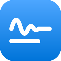

A voice wave rings out, fades like an echo, and settles into a written line, over a shorter line. White on a blue gradient, round caps, no outline, no letters. Clear space equals the stroke. Always blue, never red.
02
1-bit art
Public domain paintings of Echo, the Muses and memory, ordered-dithered to one bit (a 4 by 4 Bayer matrix) and used as a mask, so the dots take the band's light blue over film grain. Each image is used once. Never a photo, never a gradient.
03
Colour
Echo blue#0074D9. The icon, the frame.
Band#0062bd. Full-bleed sections, white text.
Action#0067c7. Buttons and links on paper.
Art#8fc3f7. The dots on the band.
Paper#fdfdfd, navy black #07111d in dark.
Ink#1a1a1a, #f2f4f7 in dark.
04
Type
The system font, SF Pro, everywhere: the apps, this site, the kit. Display is its thinnest weight in caps with tight tracking. Labels are tiny caps at 600, tracked wide. Body is regular.
Display, 100Echo
Title, 34 / 41Title
Body, 17 / 24The transcript reads at 17.
Label, 13 / 16Live
05
Space and shape
Everything sits on the 8 point grid. One radius set: square 2 on the web, rows 8, lists 20, cards 28, icon 22.5 percent, controls fully round in the apps.
06
Controls
App controls are 48 point capsules; the record button is the one circle. Web buttons are square and tracked caps. Focus is a 3 point ring at 30 percent accent. Motion is 0.2 s ease and honours reduced motion.
we are talking for a while so the live transcript keeps up with every sentence
While recording, the word being heard right now is lit in the accent.
07